Reimagining the User Experience of Martin — Proposed Changes for a More Engaging Interface
Introduction
As AI-powered assistants continue to gain traction, creating a seamless and intuitive user experience is crucial to making these tools valuable for everyday use. Martin, the AI app striving to bring Jarvis-like functionality to the public, is no exception. In our initial business audit of Martin, we explored the app’s potential and identified key areas for enhancement. Today, we’re diving into the latest proposed design updates that aim to push Martin toward a more engaging and practical interaction model.
If you’d like a UX review from us, book a time to chat here.
Proposed Design Concept Overview: Simplifying Interaction with Familiar Elements
The design team has outlined several new interface concepts that would streamline the experience, making Martin more approachable by borrowing familiar interaction models. These recommendations focus on shifting Martin’s core user interactions from voice-based responses to a chat-based interface that feels more like a natural conversation.
1. Main Screen Redesign — The Power of a Chat Interface
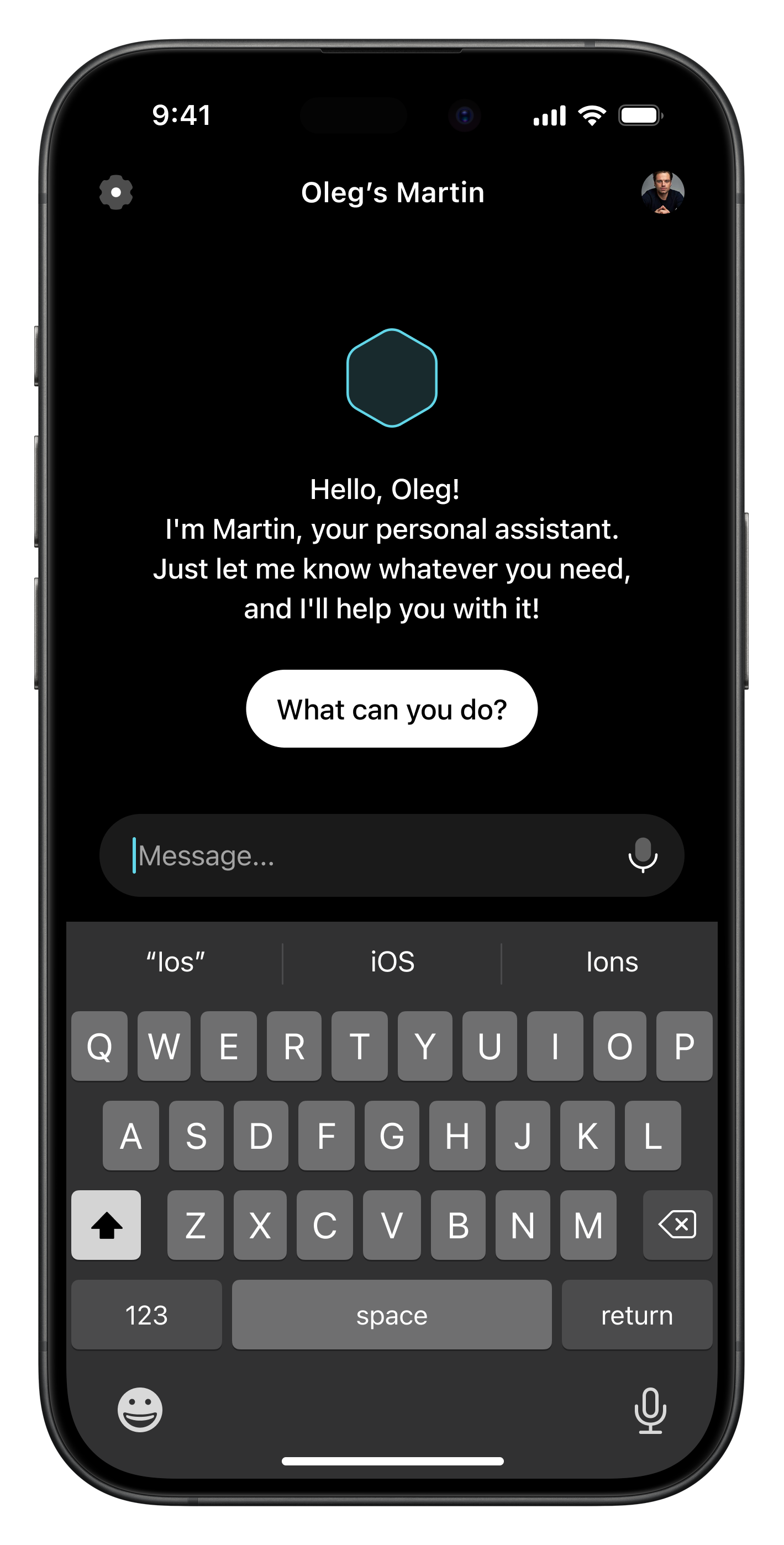
One of the primary proposals is to transform the main screen into a chat interface, displaying the conversation history with the assistant. This change aims to address multiple real-world scenarios:
Accessibility in Varied Environments: Users could interact with Martin in noisy places, during meetings, or in situations where they prefer to read rather than listen to a response.
Conversation History Reference: Having a chat-based history allows users to revisit previous answers, eliminating the inconvenience of requesting Martin to re-send responses via email or text message.
A “What can you do?” button would also be added to the first login screen to quickly inform users of Martin’s capabilities. This enhancement is intended to help new users get up to speed without needing to explore the website or the app store page.
2. Tab Bar Optimization — Reducing Screen Clutter


The design team has suggested implementing a new tab bar with an added “Message” option, serving two key purposes:
Input Flexibility: This would give users the option to type instead of speaking, making it more accessible for those who may not be able to use voice commands.
Streamlined Interface: By removing the large voice button from the bottom of the screen, the overall layout becomes cleaner, more intuitive, and less cluttered.
These adjustments are in line with the goal of minimizing unnecessary elements and ensuring that every UI component has a clear purpose.
3. Scheduled Events — Displaying Relevant Information Only When Needed


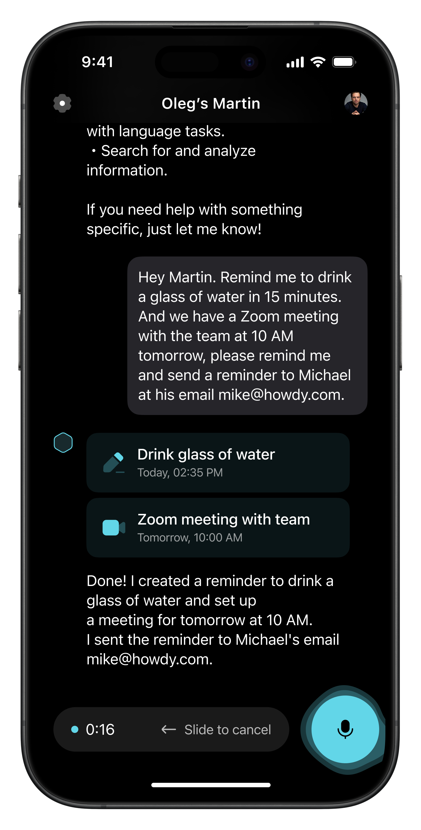
Currently, a large TO DO block appears on the main screen even when there are no upcoming reminders or meetings, creating visual noise. To tackle this, the proposed redesign suggests hiding this information behind a Scheduled button in the Tab Bar, which would only appear when relevant.
This approach would help keep the main screen focused on active conversations, while still providing easy access to time-sensitive information when necessary.
4. Micro-Interactions — Adding Delight and Usability


To make Martin feel more dynamic, the proposed version would focus on integrating micro-interactions and animations that enhance usability. For example, a subtle animation on the Scheduled button when a new meeting is added could catch the user’s attention without overwhelming them. These lightweight interactions would make Martin feel more responsive, guiding users through tasks effortlessly.
Such micro-interactions are crucial for conveying information in a lightweight manner, keeping the interface simple yet functional.
Building on Familiarity: Chat as a Gateway to Richer Interactions
Retaining the chat interface as the core interaction model is a strategic move. Users are already accustomed to chat-based interactions through messaging apps and customer support bots. However, Martin could take this a step further by integrating complex information visually within the chat format.
One suggestion involves leveraging visual elements for responses, such as weather updates. Rather than simply responding with text, Martin could present this information as visually appealing infographics. This approach would not only make the data easier to digest but also create a more memorable and engaging experience.
Future Direction: Embracing the Potential of Visual Information
The design team has additional ideas for leveraging visuals within the app. One promising concept involves reimagining the Daily Briefing feature. Currently, users receive a standard text-heavy email summarizing their day, which feels disconnected from the app’s core functionality. Instead, the proposal suggests integrating this information directly into the app with rich infographics, providing a more cohesive and accessible experience.
This pivot from text-heavy responses to visually compelling presentations is at the heart of Martin’s new UX vision. By incorporating micro-interactions, infographics, and a refined chat interface, these proposed changes aim to transform Martin from a basic AI assistant into a comprehensive digital companion.
Final Thoughts
The proposed UX and UI updates for Martin reflect a deep understanding of user behavior and preferences. By combining familiar interaction models with innovative ways of presenting information, these recommendations have the potential to make Martin a more intuitive and effective tool. If implemented, these changes would solidify Martin’s position as a leading AI companion, offering an experience that’s both powerful and user-friendly.
Stay tuned as we continue to explore and evaluate these proposed updates in our ongoing series on Martin’s evolution.